Why is Reading Crypto Charts essential for traders?
The only point that differentiates a true investor and a gambler is that instead of just jumping into the market and hoping for a fortune, investors use tools to identify market trends and ‘predict’ the future price movements of an asset. Technical analysis, or in a simpler term, reading charts, is such an indispensable tool.
Technical analysis is the process of using past price data in an attempt to project the future price movement. Therefore, the phrase ‘reading charts’ does not merely mean ‘read’, but rather ‘analyse’ charts. Finance analysts can assess market sentiments and then attempt to identify trading opportunities based on trends and price patterns on charts.
What is a Crypto Chart?
Charts’ purpose is to provide a visual representation of price action. There are various types of charts for multiple traders’ uses.
When we talk about a crypto chart, it is a visual tool that displays data about crypto price (or prices) movements and trading volume to help traders determine trends or future market sentiments.
There are different sorts of charts which each provides a specific utility. Based on their trading purposes or the characteristics of investments, investors may prefer one to another. They can also incorporate several types of charts at once to fully assist their intention. Let’s walk through some typical charts that professional traders use.
1. Line chart
Line charts are the most basic type of chart used in technical analysis. They usually use only one data point: the closing price. To identify the trend, a series of closing prices over a period of time is plotted on a chart and joined to form a line.
This type of chart also helps analysts to see patterns in price changes and assess a crypto’s performance. When several lines are laid out in a chart, it is far easier and especially useful for comparing an asset or sector’s performance against a benchmark.
2. Bar charts
Bar charts contain more information than line charts. The open, high, low, and close are used for every bar plotted on a chart. Therefore, these charts are often called OHLC (open, high, low, close).
An OHLC Chart uses the y-axis for price and the x-axis for time. Each period, for instance, a day, is represented by a symbol plotting four key values: the highest and lowest traded prices (shown by the length of a vertical line), and the opening and closing prices (marked by tick-marks on either side of this line). The symbols can be coloured to indicate market sentiment: bullish with green (closing price higher than opening) or bearish with red (closing price lower than opening).
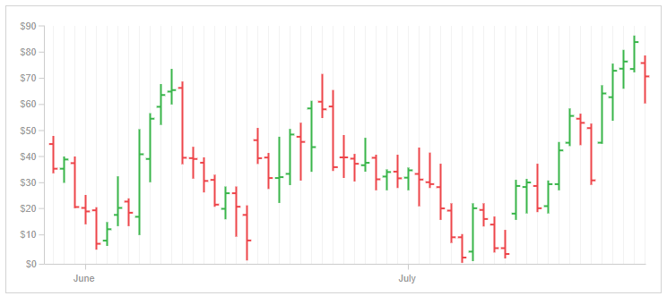
3. Candlestick chart
Candlestick charts were created in Japan in the 18th century by rice merchants. These charts then were brought to the West by Steven Nison in his book: “Japanese Candlestick Charting Techniques.”
Similar to bar charts, candlesticks use open, high, low, and close, but with better visualisation. In fact, candlestick charts are one of the most popular charts used in the West and are available on all trading platforms.
For short-term traders, there are charting services that will provide time frames from intervals of as little as one-minute charts and various intervals up to daily charts. For the longer-term trader, daily, weekly, and monthly charts are useful.
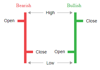
Each candlestick has two main parts: the body and the shadows, or “wicks.” The body represents the difference between the opening and closing prices of a cryptocurrency within a specific time interval. The top wick indicates the highest price reached during that interval, while the bottom wick shows the lowest price.
Candlesticks can be categorised as bearish (red-coloured) or bullish (green-coloured). A bullish candlestick has a closing price higher than its opening one. Conversely, a bearish candlestick indicates a higher opening price compared to its closing price.
By analysing candlestick patterns on crypto charts, you can identify trends and might predict future market movements.
How to Read Crypto Charts?
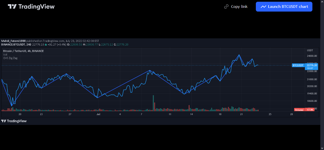
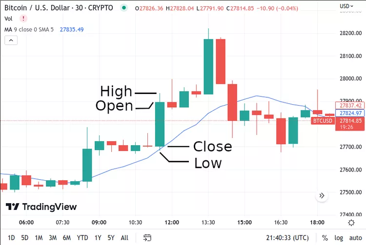
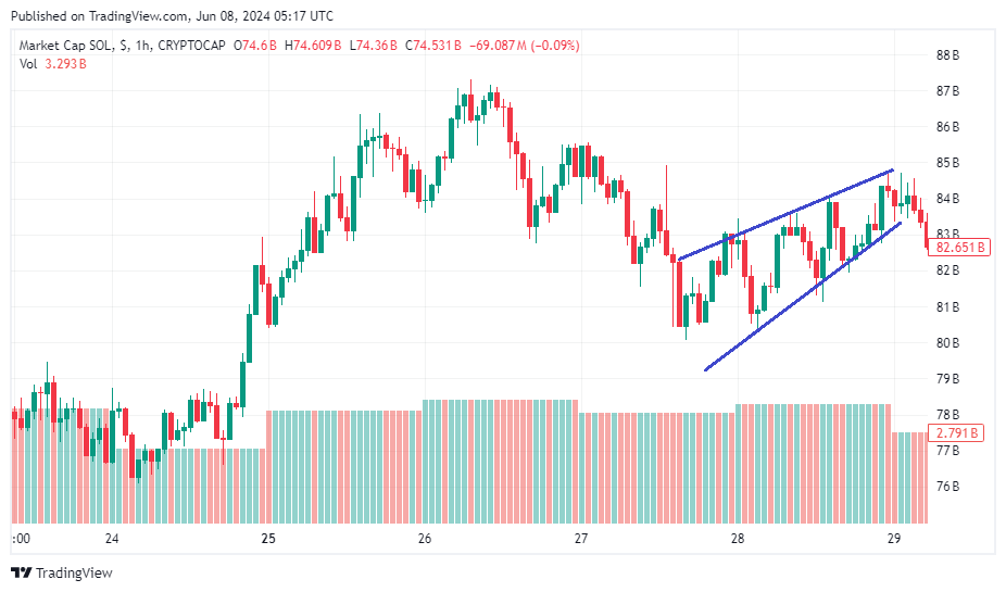
Because most crypto trading platforms use candlestick charts as the default chart, we will take this kind of chart as an illustration in our instruction on how to truly read a cryptocurrency chart. Now let’s get right into the point!
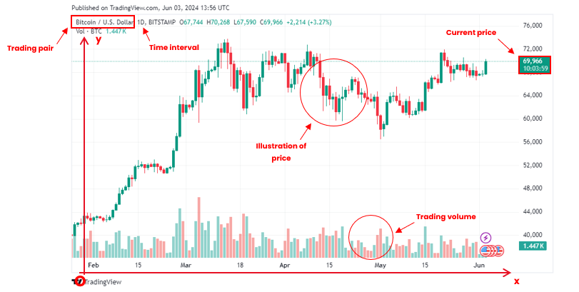
When looking at a chart, you first must understand all the basic and essential elements it includes. Look at the chart above, we can see:
- Trading pair: Indicates the base currency (BTC) and the quote currency (U.S. dollar) being used in this market. It is in the upper left corner of the chart.
- X-axis: Represent the time. It is located at the bottom of the chart.
- Time interval: Show the unit of time according to which the changes in the asset’s price follow. Increments range from as short as one day to as long as the asset’s lifetime. It’s right next to the trading pair.
- Y-axis: Represent the price of the base currency according to the quote currency. Please note that the price is calculated per base currency.
- Current price: Current price of the crypto will be framed and highlighted on the y-axis.
- Main chart: Visualise the overall rise and fall of the cryptocurrency’s price over a period of time.
- Trading volume: Below the main chart showing price movement is a smaller trading volume chart, with individual bars indicating the trading volume of an asset corresponding to the candle being shown. Longer bars indicate higher trading volumes compared to other time periods. Usually, a green bar indicates a price increase, while a red one shows a price decrease.
Now you know the fundamentals. Whenever you look at a chart, try to comprehend all those elements above, and you will get a sense of what that chart is communicating. Before moving to some chart’s pattern, we would like to show the actual way to approach a chart in a more concrete way.
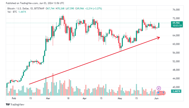
One easy way to read the structure is by simply looking at the left corner of the chart. In this case, the price is moving from the lower left corner to upper right corner of the chart. This would be considered an uptrend over that period of time.
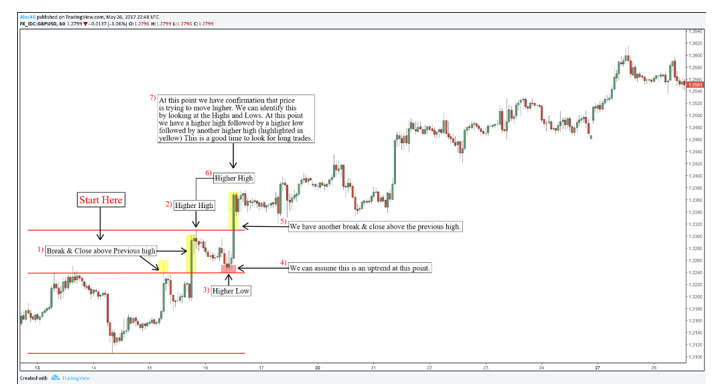
We continue with the highs and lows. Look at point (1). Here we see the first high was broken as the second high surpassed the first one’s shadow and achieved a new record. Pay attention to the low at point (3) also. The bottom wicks of the candlesticks were close to the top wick of the initial high, and we can consider this is an up trend at this point.
At point (6), we have another break and close above the previous high. This constitutes confirmation that the price is trying to move higher, or in simple terms, the start of a bull run.
Crypto Chart Patterns
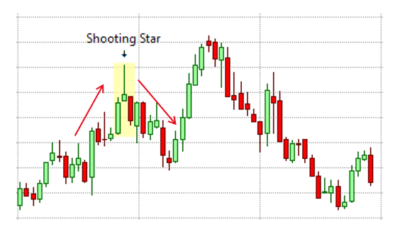
The shooting star is a bearish pattern that typically appears at the end of an upward price trend. It features a short body near the bottom with a long wick extending upwards, indicating that an asset’s price decreased slightly by the end of the trading period after reaching higher levels. Analysts see this as a sign of resistance to further price increases, suggesting an imminent sell-off as many traders anticipate a price drop.
Inverted Hammer Candlestick
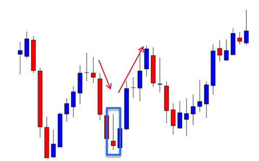
Inverted hammer pattern can be considered an opposite version of the shooting star as it indicates bullish sign. The pattern shows a slight price increase by the end of the trading period after reaching higher prices. When this candlestick appears following a downtrend, analysts often view it as a positive sign, indicating potential price rebound due to high buying demand.
Head and Shoulders in Crypto Charts
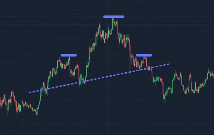
The head and shoulders pattern above is a bearish reversal indicator with three peaks: a higher peak in the middle (the head) and two lower peaks on either side (the shoulders). The neckline, a support level, connects the lows between the left shoulder, head, and right shoulder. This pattern suggests that the cryptocurrency’s price is likely to decline, and traders should consider short positions. A break below the neckline confirms the bearish trend.
By contrast, the inverse head and shoulders pattern is a bullish reversal indicator with three troughs: a lower trough in the middle (the head) and two higher troughs on either side (the shoulders). The neckline, a resistance level, connects the highs between the left shoulder, head, and right shoulder. When the price breaks above the neckline, it signals the confirmation of a bullish trend. This is when traders should consider long positions.
Wedges in Crypto Charts
‘Wedges’ are identified by drawing lines connecting the lower points and peaks of price movements over time. When these lines converge from left to right and form a wedge, it indicates potential price movements. A bullish wedge, characterised by downward-sloping lines converging to form a downward-pointing triangle, suggests stabilising prices near the bottom with a potential upward swing.
Conversely, a bearish wedge, with upward-sloping lines nearing convergence at a high point, often precedes a peak and subsequent sell-off.
Key Technical Indicators
Technical indicators are pattern-based signals or mathematical calculations produced by or based on the price, market cap, or open interest of a security/commodity.
In these indicators’ introductions, you might find the phrase “support and resistance levels” several times. Basically, support levels occur when the demand for an asset rises to match the supply. This causes the price to stop falling and start to stabilise. If the support level is breached, prices usually continue to decline until a new support level is established. However, when a support level is broken, it often transforms into a new resistance level in the future.
Resistance levels, in contrast, are formed when supply matches demand. In an uptrend, prices continue to increase until they reach a level where demand no longer exceeds supply, and no more traders willing to sell at these levels. If prices break through a resistance level, they tend to continue rising until they find a new level of resistance. The old resistance level will often become a new support level.
Now, here are the most basic and commonly used technical indicators, especially in the crypto industry:
1. Simple moving average (SMA)
SMA is basically the average of a token’s price over a specific period.
This indicator takes a set of price points for a cryptocurrency and divides them by the number of data points to produce a single trend line.
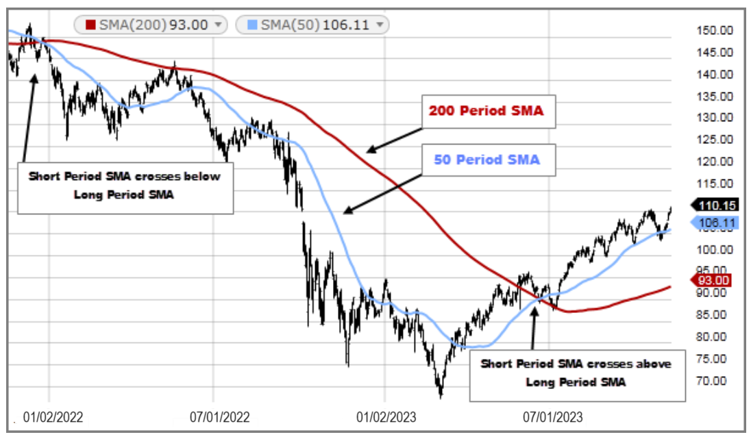
SMAs are often used to determine trend direction. If the indicator is moving up, the trend is bearish. Otherwise, it’s down. A 200-day SMA is a proxy for long-term trends, while 50-day SMAs are typical for intermediate trends.
2. Exponential moving average (EMA)
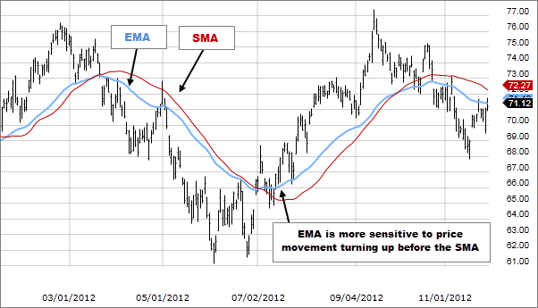
EMA is similar to the SMA as it also measures trend direction over a specific time period. However, EMA applies more weight to data which is more current and therefore it is more responsive to prices.
The most popular EMAs for short-term averages are 12- and 26-day EMAs, and 50- and 200-day EMAs for long-term averages.
3. Relative strength index (RSI)
RSI measures the speed and change of price movements. The RSI oscillates between 0 and 100 and is represented by a line graph. A crypto asset is considered overbought when its RSI is greater than or equal to 70 and oversold when the figure goes under 30.
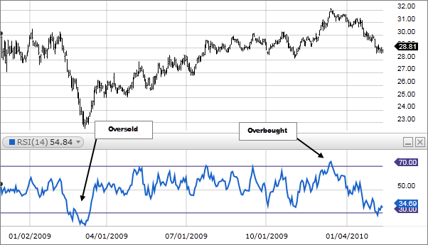
An overbought signal indicates that a short-term rally has reached its peak and the asset is due to a price correction. Meanwhile, an oversold signal suggests that a short-term downtrend has reached exhaustion, and the asset is ready for a rally.
4. Moving Average Convergence Divergence (MACD)
Like RSI, The Moving Average Convergence/ Divergence (MACD) is a momentum oscillator. It is one of the most popular and well-known indicators developed in the late 1970s by Gerald Appel. This indicator is plotted with two lines:
- The MACD line, which is the difference between the 12-day exponential moving average (EMA) subtracted from the 26-day EMA
- The signal line, which is the 9-day EMA of the MACD
The two lines fluctuate around a centre line, which is at zero. There is no upper and lower limit to the indicator.
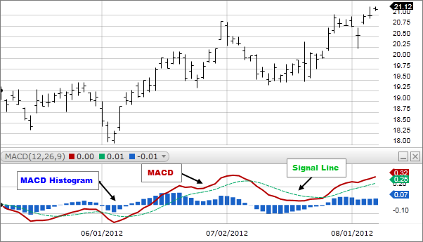
The most common use of the MACD is for signal line crossovers. The signal line trails the MACD line. When the MACD line turns up and crosses the signal line, that is bullish. When the MACD turns down and crosses the signal line, it is bearish.


