
What are candlestick charts?
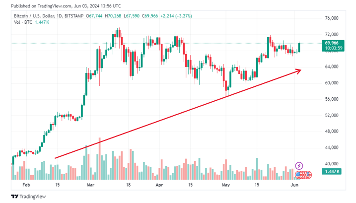
Let’s take a look at a real BTC – USD candlestick chart from TradingView:
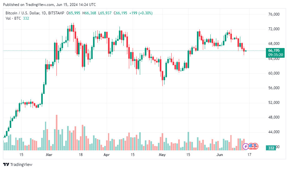
Candlestick charts give you an instant capture of whether a market’s price movement was positive or negative, and to what degree. These charts were created in Japan in the 18th century by rice merchants and then were brought to the West by Steven Nison in his book: “Japanese Candlestick Charting Techniques.” In fact, candlestick charts are one of the most popular charts used in the West and are available on all trading platforms.
The timeframe in a candlestick chart can vary widely to cater to investors’ need. For short-term traders, there are charting services that will provide time frames from intervals of as little as one-minute charts and various intervals up to daily charts. For the longer-term trader, daily, weekly, and monthly charts are useful.
Analysis of a candlestick
Similar to bar charts, candlesticks use open, high, low, and close, but with better visualisation.
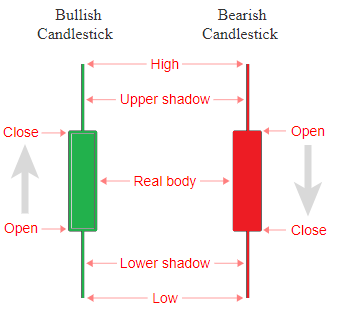
Each candlestick has two main parts: the body and the shadows, or “wicks,” as shown in the picture above.
- The body represents the difference between the opening and closing prices of a cryptocurrency within a specific time interval.
- The top wick indicates the highest price reached during that interval, while the bottom wick shows the lowest price.
Candlesticks can be categorised as bearish (red-coloured) or bullish (green-coloured). A bullish candlestick has a closing price higher than its opening one. Conversely, a bearish candlestick indicates a higher opening price compared to its closing price.
By analysing candlestick patterns on crypto charts, you can identify trends and might predict future market movements.
How to read ‘one-candle signals’
When trading in really short time frames, traders sometimes just need to concentrate on merely one candle. There are four typical one-candle signals that you should be familiar with:
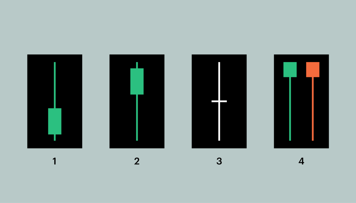
- Long upper shadow: A long upper shadow could be an indicator of a bearish trend. The longer the upper wick, the stronger an indicator is.
- Long lower shadow: Conversely, this could be a bullish signal. The longer the lower shadow, the more reliable the signal is.
- Doji candle: A Doji candle has no body, as the open and close price are equal. This means that there is indecision in the market, and there is a possibility of an upcoming price reversal. (Doji means error in Japanese)
- Umbrellas: In umbrellas, there are long bottom wicks. A red umbrella is called a hammer, meaning that the asset is undergoing some serious buy action, and the price might soon be going up. Green umbrellas are known as hanging men. In contrast to the red ones, they often signal that sellers are ready to cash out.
Note that while one-candle signals can provide valuable insights, to accurately interpret the market, you must understand the broader context. Identifying trends and patterns in candlestick charts can be challenging. If you’re unsure about the best investment strategy for you, consult with a professional advisor.
How to read candlestick charts
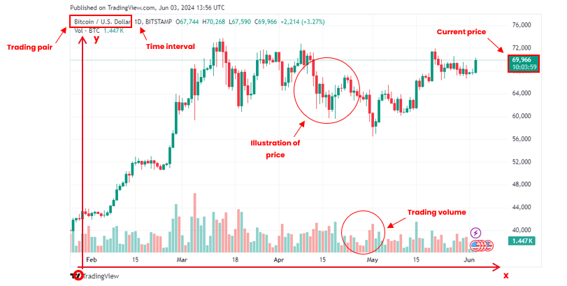
When looking at a chart, you first need to understand all the basic elements it includes. Look at the chart above, we can see:
- Trading pair: Indicates the base currency (BTC) and the quote currency (U.S. dollar) being used in this market. It is in the upper left corner of the chart.
- X-axis: Represent the time. It is located at the bottom of the chart.
- Time interval: Show the unit of time according to which the changes in the asset’s price follow. Increments range from as short as one day to as long as the asset’s lifetime. It’s right next to the trading pair.
- Y-axis: Represent the price of the base currency according to the quote currency. Please note that the price is calculated per base currency.
- Current price: Current price of the crypto will be framed and highlighted on the y-axis.
- Main chart: Visualise the overall rise and fall of the cryptocurrency’s price over a period of time.
- Trading volume: Below the main chart showing price movement is a smaller trading volume chart, with individual bars indicating the trading volume of an asset corresponding to the candle being shown. Longer bars indicate higher trading volumes compared to other time periods. Usually, a green bar indicates a price increase, while a red one shows a price decrease.
Now you know the fundamentals. Whenever you look at a chart, try to comprehend all those elements above, and you will get a sense of what that chart is communicating. Before moving to some chart’s pattern, we would like to show the actual way to approach a chart in a more concrete way.
One easy way to read the structure is by simply looking at the left corner of the chart. In this case, the price is moving from the lower left corner to the upper right corner of the chart. This would be considered an uptrend over that period.
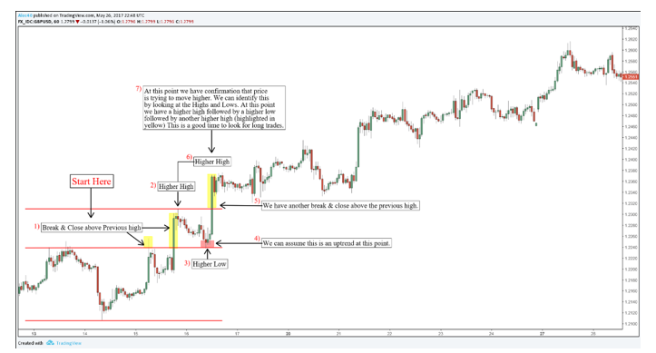
We continue with the highs and lows. Look at point (1). Here we see the first high was broken as the second high surpassed the first one’s shadow and achieved a new record. Pay attention to the low at point (3) also. The bottom wicks of the candlesticks were close to the top wick of the initial high, and we can consider this is an up trend at this point.
At point (6), we have another break and close above the previous high. This constitutes confirmation that the price is trying to move higher, or in simple terms, the start of a bull run.
Candlestick Chart Patterns
Shooting Star
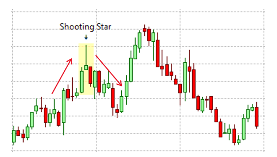
The shooting star is a bearish pattern that typically appears at the end of an upward price trend. It features a short body near the bottom with a long wick extending upwards, indicating that an asset’s price decreased slightly by the end of the trading period after reaching higher levels. Analysts see this as a sign of resistance to further price increases, suggesting an imminent sell-off as many traders anticipate a price drop.
Inverted Hammer Candlestick
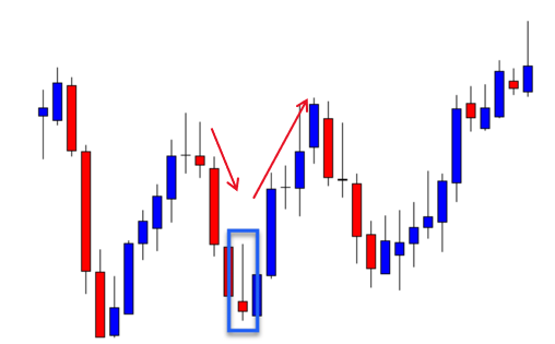
Inverted hammer pattern can be considered an opposite version of the shooting star as it indicates bullish sign. The pattern shows a slight price increase by the end of the trading period after reaching higher prices. When this candlestick appears following a downtrend, analysts often view it as a positive sign, indicating potential price rebound due to high buying demand.
Head and Shoulders
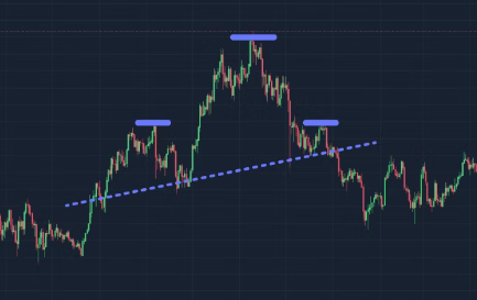
The head and shoulders pattern above is a bearish reversal indicator with three peaks: a higher peak in the middle (the head) and two lower peaks on either side (the shoulders). The neckline, a support level, connects the lows between the left shoulder, head, and right shoulder. This pattern suggests that the cryptocurrency’s price is likely to decline, and traders should consider short positions. A break below the neckline confirms the bearish trend.
By contrast, the inverse head and shoulders pattern is a bullish reversal indicator with three troughs: a lower trough in the middle (the head) and two higher troughs on either side (the shoulders). The neckline, a resistance level, connects the highs between the left shoulder, head, and right shoulder. When the price breaks above the neckline, it signals the confirmation of a bullish trend. This is when traders should consider long positions.
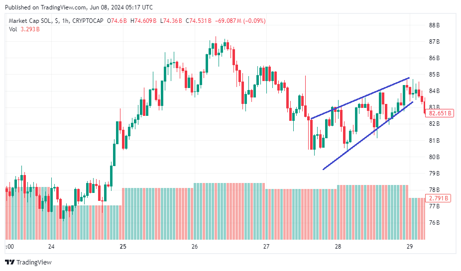
Wedges
‘Wedges’ are identified by drawing lines connecting the lower points and peaks of price movements over time. When these lines converge from left to right and form a wedge, it indicates potential price movements. A bullish wedge, characterised by downward-sloping lines converging to form a downward-pointing triangle, suggests stabilising prices near the bottom with a potential upward swing.
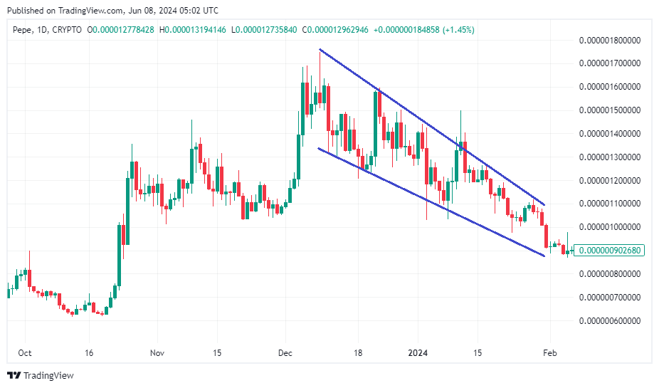
Conversely, a bearish wedge, with upward-sloping lines nearing convergence at a high point, often precedes a peak and subsequent sell-off.


